#flexbox properties
Explore tagged Tumblr posts
Visit Tumblr Blog
Explore Tumblr blogs with no restrictions, modern design and the best experience.
Last Seen Tumblr Blogs


Fun Fact
Premium Tumblr themes are available from anywhere between $9 to $49.
Text
Propiedades de las Cajas o Bloques en HTML y su Importancia
En HTML, todos los elementos, desde un simple párrafo hasta una imagen compleja, se representan como cajas. Estas cajas tienen propiedades que nos permiten controlar su tamaño, posición, espaciado y otros aspectos visuales. Comprender estas propiedades es fundamental para crear diseños web personalizados y atractivos. ¿Qué es el Modelo de Caja en CSS? El modelo de caja es una representación…
#CSS#css box model#CSS layout#CSS properties#desarrollo web#diseño responsive#Diseño web#Diseño web personalizado#Flexbox#Grid#Guía CSS#HTML#layout#Modelo de caja CSS#Posicionamiento CSS#propiedades CSS#Tutorial CSS#z-index
1 note
·
View note
Text
flex-direction: row; & flex-direction: column;
Flexbox has a property called flex-direction and this determines the direction that the flex items are displayed.
flex-direction: row; - this is the default and aligns the items across the page, making the main axis, left to right and the cross axis, top to bottom.

When this property is applied with this value, and if you use the flex-basis property on the flex items within this container, it would affect the width of the items:

if we apply a flex-basis of 500px to the first child div, it would change the width of the div.
flex-direction: column; - this aligns the items down the page, making the main axis from top to bottom and the cross axis from left to right.

When this property is applied with this value, and if you use the flex-basis property on the flex items within this container, it would affect the height of the items:

if we apply a flex-basis of 300px to the first child div, it would change the height of the div.
The flex-basis property interacts with the main axis, and depending on the direction of the main axis, determines whether the flex-basis will change the items' width or height.
#codeblr#coding#studyblr#studying#programmer#coder#study#progblr#programming#random notes#css#flexbox
88 notes
·
View notes
Text
My Neocities!
I'd like to introduce my Neocities page, which I've been building with HTML/CSS.
The splash page features two doors that open when you hover over them, which lead to my other pages. I animated the doors using the CSS "transform" property.
I recently updated this to make it look more like a 3d building, using box-shadow and transform: skewX :)

Then in the Cat Clubhouse, you will find a drag n drop game in which you position cute kitties into a bedroom! (Let me know if you try it out!!!)
The drag n drop function doesn't work on touch screens, unfortunately. I may have to find a clever alternative for non-desktop use.
Upcoming tasks:
Creating a sticky sidebar for site navigation. I don't know why I've been struggling so much with this, but whether using flexbox or relative/absolute positioning, I've been struggling to position things with the spacing and centering I want, and to also make it responsive to smaller screens.
Adding a guestbook using ayano's neocities comment widget (so excited to try this out!)
Uploading my first tribute page. I've been working on something fun and cheeky, and I'll update here with progress!
An About Me page.
Feel free to add me on Neocities [https://neocities.org/site/clubjessica] and I'll check out your site too!
42 notes
·
View notes
Text
Yet Another Anchor Positioning Quirk
New Post has been published on https://thedigitalinsider.com/yet-another-anchor-positioning-quirk/
Yet Another Anchor Positioning Quirk
I strongly believe Anchor Positioning will go down as one of the greatest additions to CSS. It may not be as game-changing as Flexbox or Grid, but it does fill a positioning gap that has been missing for decades. As awesome as I think it is, CSS Anchor Positioning has a lot of quirks, some of which are the product of its novelty and others due to its unique way of working. Today, I want to bring you yet another Anchor Positioning quirk that has bugged me since I first saw it.
The inception
It all started a month ago when I was reading about what other people have made using Anchor Positioning, specifically this post by Temani Afif about “Anchor Positioning & Scroll-Driven Animations.” I strongly encourage you to read it and find out what caught my eye there. Combining Anchor Positioning and Scroll-Driven Animation, he makes a range slider that changes colors while it progresses.
Amazing by itself, but it’s interesting that he is using two target elements with the same anchor name, each attached to its corresponding anchor, just like magic. If this doesn’t seem as interesting as it looks, we should then briefly recap how Anchor Positioning works.
CSS Anchor Positioning and the anchor-scope property
See our complete CSS Anchor Positioning Guide for a comprehensive deep dive.
Anchor Positioning brings two new concepts to CSS, an anchor element and a target element. The anchor is the element used as a reference for positioning other elements, hence the anchor name. While the target is an absolutely-positioned element placed relative to one or more anchors.
An anchor and a target can be almost every element, so you can think of them as just two div sitting next to each other:
<div class="anchor">anchor</div> <div class="target">target</div>
To start, we first have to register the anchor element in CSS using the anchor-name property:
.anchor anchor-name: --my-anchor;
And the position-anchor property on an absolutely-positioned element attaches it to an anchor of the same name. However, to move the target around the anchor we need the position-area property.
.target position: absolute; position-anchor: --my-anchor; position-area: top right;
This works great, but things get complicated if we change our markup to include more anchors and targets:
<ul> <li> <div class="anchor">anchor 1</div> <div class="target">target 1</div> </li> <li> <div class="anchor">anchor 2</div> <div class="target">target 2</div> </li> <li> <div class="anchor">anchor 3</div> <div class="target">target 3</div> </li> </ul>
Instead of each target attaching to its closest anchor, they all pile up at the last registered anchor in the DOM.
The anchor-scope property was introduced in Chrome 131 as an answer to this issue. It limits the scope of anchors to a subtree so that each target attaches correctly. However, I don’t want to focus on this property, because what initially caught my attention was that Temani didn’t use it. For some reason, they all attached correctly, again, like magic.
What’s happening?
Targets usually attach to the last anchor on the DOM instead of their closest anchor, but in our first example, we saw two anchors with the same anchor-name and their corresponding targets attached. All this without the anchor-scope property. What’s happening?
Two words: Containing Block.
Something to know about Anchor Positioning is that it relies a lot on how an element’s containing block is built. This isn’t something inherently from Anchor Positioning but from absolute positioning. Absolute elements are positioned relative to their containing block, and inset properties like top: 0px, left: 30px or inset: 1rem are just moving an element around its containing block boundaries, creating what’s called the inset-modified containing block.
A target attached to an anchor isn’t any different, and what the position-area property does under the table is change the target’s inset-modified containing block so it is right next to the anchor.
Usually, the containing block of an absolutely-positioned element is the whole viewport, but it can be changed by any ancestor with a position other than static (usually relative). Temani takes advantage of this fact and creates a new containing block for each slider, so they can only be attached to their corresponding anchors. If you snoop around the code, you can find it at the beginning:
label position: relative; /* No, It's not useless so don't remove it (or remove it and see what happens) */
If we use this tactic on our previous examples, suddenly they are all correctly attached!
Yet another quirk
We didn’t need to use the anchor-scope property to attach each anchor to its respective target, but instead took advantage of how the containing block of absolute elements is computed. However, there is yet another approach, one that doesn’t need any extra bits of code.
This occurred to me when I was also experimenting with Scroll-Driven Animations and Anchor Positioning and trying to attach text-bubble footnotes on the side of a post, like the following:
Logically, each footnote would be a target, but the choice of an anchor is a little more tricky. I initially thought that each paragraph would work as an anchor, but that would mean having more than one anchor with the same anchor-name. The result: all the targets would pile up at the last anchor:
This could be solved using our prior approach of creating a new containing block for each note. However, there is another route we can take, what I call the reductionist method. The problem comes when there is more than one anchor with the same anchor-name, so we will reduce the number of anchors to one, using an element that could work as the common anchor for all targets.
In this case, we just want to position each target on the sides of the post so we can use the entire body of the post as an anchor, and since each target is naturally aligned on the vertical axis, what’s left is to move them along the horizontal axis:
You can better check how it was done on the original post!
Conclusion
The anchor-scope may be the most recent CSS property to be shipped to a browser (so far, just in Chrome 131+), so we can’t expect its support to be something out of this world. And while I would love to use it every now and there, it will remain bound to short demos for a while. This isn’t a reason to limit the use of other Anchor Positioning properties, which are supported in Chrome 125 onwards (and let’s hope in other browsers in the near future), so I hope these little quirks can help you to keep using Anchor Positioning without any fear.
#amazing#amp#anchor positioning#animation#animations#approach#Articles#attention#browser#change#chrome#code#colors#comprehensive#CSS#eye#fear#focus#Future#game#gap#grid#how#inset#it#Method#One#Other#positioning#Read
3 notes
·
View notes
Text
ohhh my gooood the flexbox property in css is so much simpler than classfix idc if i have to write more lines of code classfix literally just doesnt work for no reason sometimes
3 notes
·
View notes
Text
Learn HTML and CSS: A Comprehensive Guide for Beginners
Introduction to HTML and CSS
HTML (HyperText Markup Language) and CSS (Cascading Style Sheets) are the core technologies for creating web pages. HTML provides the structure of the page, while CSS defines its style and layout. This guide aims to equip beginners with the essential knowledge to start building and designing web pages.
Why Learn HTML and CSS?
HTML and CSS are fundamental skills for web development. Whether you're looking to create personal websites, start a career in web development, or enhance your current skill set, understanding these technologies is crucial. They form the basis for more advanced languages and frameworks like JavaScript, React, and Angular.
Getting Started with HTML and CSS
To get started, you need a text editor and a web browser. Popular text editors include Visual Studio Code, Sublime Text, and Atom. Browsers like Google Chrome, Firefox, and Safari are excellent for viewing and testing your web pages.
Basic HTML Structure
HTML documents have a basic structure composed of various elements and tags. Here’s a simple example:
html
Copy code
<!DOCTYPE html>
<html>
<head>
<title>My First Web Page</title>
<link rel="stylesheet" type="text/css" href="styles.css">
</head>
<body>
<h1>Welcome to My Web Page</h1>
<p>This is a paragraph of text on my web page.</p>
</body>
</html>
: Declares the document type and HTML version.
: The root element of an HTML page.
: Contains meta-information about the document.
: Connects the HTML to an external CSS file.
: Contains the content of the web page.
Essential HTML Tags
HTML uses various tags to define different parts of a web page:
to : Headings of different levels.
: Paragraph of text.
: Anchor tag for hyperlinks.
: Embeds images.
: Defines divisions or sections.
: Inline container for text.
Creating Your First HTML Page
Follow these steps to create a simple HTML page:
Open your text editor.
Write the basic HTML structure as shown above.
Add a heading with the tag.
Add a paragraph with the tag.
Save the file with a .html extension (e.g., index.html).
Open the file in your web browser to view your web page.
Introduction to CSS
CSS is used to style and layout HTML elements. It can be included within the HTML file using the <style> tag or in a separate .css file linked with the <link> tag.
Basic CSS Syntax
CSS consists of selectors and declarations. Here’s an example:
css
Copy code
h1 {
color: blue;
font-size: 24px;
}
Selector (h1): Specifies the HTML element to be styled.
Declaration Block: Contains one or more declarations, each consisting of a property and a value.
Styling HTML with CSS
To style your HTML elements, you can use different selectors:
Element Selector: Styles all instances of an element.
Class Selector: Styles elements with a specific class.
ID Selector: Styles a single element with a specific ID.
Example:
html
Copy code
<!DOCTYPE html>
<html>
<head>
<title>Styled Page</title>
<link rel="stylesheet" type="text/css" href="styles.css">
</head>
<body>
<h1 class="main-heading">Hello, World!</h1>
<p id="intro">This is an introduction paragraph.</p>
</body>
</html>
In the styles.css file:
css
Copy code
.main-heading {
color: green;
text-align: center;
}
#intro {
font-size: 18px;
color: grey;
}
CSS Layout Techniques
CSS provides several layout techniques to design complex web pages:
Box Model: Defines the structure of an element’s content, padding, border, and margin.
Flexbox: A layout model for arranging items within a container, making it easier to design flexible responsive layouts.
Grid Layout: A two-dimensional layout system for more complex layouts.
Example of Flexbox:
css
Copy code
.container {
display: flex;
justify-content: space-around;
}
.item {
width: 100px;
height: 100px;
background-color: lightblue;
}
Best Practices for Writing HTML and CSS
Semantic HTML: Use HTML tags that describe their meaning clearly (e.g., , , ).
Clean Code: Indent nested elements and use comments for better readability.
Validation: Use tools like the W3C Markup Validation Service to ensure your HTML and CSS are error-free and standards-compliant.
Accessibility: Make sure your website is accessible to all users, including those with disabilities, by using proper HTML tags and attributes.
Free Resources to Learn HTML and CSS
W3Schools: Comprehensive tutorials and references.
MDN Web Docs: Detailed documentation and guides for HTML, CSS, and JavaScript.
Codecademy: Interactive courses on web development.
FreeCodeCamp: Extensive curriculum covering HTML, CSS, and more.
Khan Academy: Lessons on computer programming and web development.
FAQs about Learning HTML and CSS
Q: What is HTML and CSS? A: HTML (HyperText Markup Language) structures web pages, while CSS (Cascading Style Sheets) styles and layouts the web pages.
Q: Why should I learn HTML and CSS? A: Learning HTML and CSS is essential for creating websites, understanding web development frameworks, and progressing to more advanced programming languages.
Q: Do I need prior experience to learn HTML and CSS? A: No prior experience is required. HTML and CSS are beginner-friendly and easy to learn.
Q: How long does it take to learn HTML and CSS? A: The time varies depending on your learning pace. With consistent practice, you can grasp the basics in a few weeks.
Q: Can I create a website using only HTML and CSS? A: Yes, you can create a basic website. For more complex functionality, you'll need to learn JavaScript.
Q: What tools do I need to start learning HTML and CSS? A: You need a text editor (e.g., Visual Studio Code, Sublime Text) and a web browser (e.g., Google Chrome, Firefox).
Q: Are there free resources available to learn HTML and CSS? A: Yes, there are many free resources available online, including W3Schools, MDN Web Docs, Codecademy, FreeCodeCamp, and Khan Academy.
#how to learn html and css#html & css course#html & css tutorial#html and css#html course#html css tutorial#html learn#html learn website#learn html#learn html and css#html and css course#html and css full course#html and css online course#how to learn html and css for beginners
3 notes
·
View notes
Text

📰 CSS Landscape 2024 #5: Fresh updates from Firefox 124 & Chrome 123 focusing on new CSS properties. Dive into articles, tutorials & videos on accessible forms, text emphasis, color preferences, animations & flexbox. Stay tuned! → https://freefrontend.com/css-landscape-2024-04-12/
5 notes
·
View notes
Note
omg i saw ur neocities how did you make it look tht good what's ur secret
when on mobile, go into your address bar, and type "view-source:" without spaces in front of ANY url from my website. unsure if it works on desktop. let me know if it does.
this will allow you to take a closer look at my spaghetti html code, here's an example of a view-sourced link you can look at yourself:
view-source:https://kopawz.neocities.org/
my landing page for example, you will notice,
+ has many flex boxes JUST so i can center everything on the page. i like it that way. do i have to do it like this? no but i like it.
+ every green box i'm putting text in is the same base element from the css. they're all the exact same <aside> lol. they are all called asides because i was initially fiddling with a template, but it was very cluttered and noisy, so...
+ i decided to just use one base element, and use a rampant amount of in-line styling in the html to customize each aside box's size, shape, and other properties, instead of several different elements in the css. it just works better for me that way.
+ i didn't feel like learning how to make images/elements stack on top of eachother, so i set a flexbox to force images to wrap around once they hit the box's max width limit. it's fun to brute-force things!
+ there is no secret, just fuck around and find out what makes most sense to you when making it, so you can understand it for yourself. nobody but you sees the blueprint.
above all else, laugh and learn from your own mistakes- do not use them as weapons against yourself as "proof" that you shouldn't try. 👍
10 notes
·
View notes
Note
line-height anon! sorry for disturbing, but could you explain (if you don’t mind) why i couldn’t add “line-height” under the CSS class(? identifier??) “.tags”? it already has some properties like height above the tag and font-weight, so it boggles my mind a little when adding line-height did nothing but break the code.
I use flexbox to "hold the tags" and a "gap: 20px;" to keep spacing/margins between the tags. it would only affect the tags container itself. You need to target the links inside the tag container 😊
1 note
·
View note
Text
CSS 58 💻 Cheatsheet
New Post has been published on https://tuts.kandz.me/css-58-%f0%9f%92%bb-cheatsheet/
CSS 58 💻 Cheatsheet

youtube
Basic Selectors Element Selector: Targets elements by tag name. `p color: blue; ` Class Selector: Targets elements with a specific class. ` .highlight background-color: yellow; ` ID Selector: Targets an element with a specific ID (unique). ` #main-title font-size: 36px; ` Universal Selector: Applies to all elements. ` * margin: 0; padding: 0; ` Attribute Selector: Targets elements with specific attributes or attribute values. `[type="text"] border: 1px solid black; ` Combinators Descendant Combinator (Space): Selects elements that are descendants of another element. ` div p color: red; ` Child Combinator ( ): Selects direct children of an element. ` ul li font-weight: bold; ` Adjacent Sibling Combinator (+): Selects the element immediately following another element. ` h1 + p margin-top: 20px; ` General Sibling Combinator (~): Selects all siblings that follow another element. ` h2 ~ p font-style: italic; ` Box Model Margin: The space outside the border. ``` margin: 10px; margin-top: 20px; margin-left: 30px; margin-right: 40px; margin-bottom: 50px; ``` Padding: The space inside the border. ``` padding: 10px; padding-top: 20px; padding-left: 30px; padding-right: 40px; padding-bottom: 50px; ``` Border: The line around an element. ``` border: 1px solid black; border-width: 2px; border-style: dashed; border-color: red; ``` Width/Height: Sets the width and height of an element. ``` width: 300px; height: 200px; ``` Typography Font Family: Specifies the font family for text. `font-family: Arial, sans-serif;` Font Size: Sets the size of the font. `font-size: 16px;` Font Weight: Controls the boldness of the font. ` font-weight: bold;` Text Align: Aligns text within an element. ` text-align: center;` Background Background Color: Sets the background color of an element. `background-color: #f0f0f0;` Background Image: Sets a background image for an element. `background-image: url('image.jpg');` Background Repeat: Controls how the background image is repeated. `background-repeat: no-repeat;` Background Position: Positions the background image within an element. ` background-position: center;` Display Display Block: Makes an element take up the full width available and start on a new line. ` display: block;` Display Inline: Allows elements to sit next to each other horizontally. ` display: inline;` Display Inline-Block: Combines both inline and block properties. ` display: inline-block;` Display Flex: Creates a flex container for child elements. `display: flex;` Display Grid: Creates a grid container for child elements. ` display: grid;` Positioning Position Static: Default value. Elements are positioned according to the normal flow of the document. ` position: static;` Position Relative: Moves an element relative to its normal position. ``` position: relative; top: 20px; left: 30px; ``` Position Absolute: Positions an element relative to the nearest positioned ancestor (not static). ``` position: absolute; top: 50px; right: 100px; ``` Position Fixed: Keeps an element in a fixed position even when scrolling. ``` position: fixed; bottom: 20px; left: 30px; ``` Flexbox Flex Direction: Defines the direction of the main axis (row or column). ``` flex-direction: row; /* Default */ flex-direction: column; ``` Justify Content: Aligns items along the main axis. ``` justify-content: flex-start; /* Default */ justify-content: center; justify-content: flex-end; justify-content: space-between; justify-content: space-around; ``` Align Items: Aligns items along the cross axis. ``` align-items: stretch; /* Default */ align-items: flex-start; align-items: center; align-items: flex-end; ``` Grid Grid Template Columns: Defines the number and size of columns in a grid container. ` grid-template-columns: repeat(3, 1fr);` Grid Template Rows: Defines the number and size of rows in a grid container. ` grid-template-rows: auto;` Justify Items: Aligns items along the row axis within their grid area. ``` justify-items: start; /* Default */ justify-items: center; justify-items: end; justify-items: stretch; ``` Align Items: Aligns items along the column axis within their grid area. ``` align-items: start; /* Default */ align-items: center; align-items: end; align-items: stretch; ``` Other Useful Properties Color: Sets the color of text. ` color: #333333;` Opacity: Sets the opacity level of an element. ` opacity: 0.5;` Margin/Padding: Controls the space around or inside an element. ``` margin: 10px; padding: 20px; ``` Box Shadow: Adds a shadow effect to an element. ` box-shadow: 2px 4px 6px rgba(0, 0, 0, 0.5);` Transform: Applies 2D or 3D transformations to an element. ` transform: rotate(90deg);`
0 notes
Text
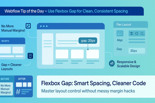
🌟 Webflow Tip of the Day – Use Flexbox Gap for Clean, Consistent Spacing
When building layouts in Webflow using Flexbox, don’t manually add margins between elements. Instead, use the “Gap” property for smarter, scalable, and more elegant spacing.
🔧 How to Use Flex Gap:
Select your Flex container
In the Style Panel → under Layout → enable Flex
Use the Gap field to set uniform spacing (e.g., 20px)
This works both for horizontal and vertical spacing!
✅ Why It’s Better Than Margins:
Maintains consistent spacing across breakpoints
Cleaner code — no messy margin overrides
Easier to manage on large-scale layouts
Improves responsiveness and scalability
💡 Practical Examples:
Equal spacing between buttons in a CTA
Neat rows of cards or feature boxes
Structured menu items in navbars
🔄 Bonus Tip: Use with Grid layout too — Gap is a game-changer there as well!
🚀 Want to build pixel-perfect, responsive Webflow sites like a pro? 📌 Connect With Me:
🌐 Portfolio: www.webflowwork.com 🎯 Upwork: https://bit.ly/4iu6AKd 🎯 Fiverr: https://bit.ly/3EzQxNd
#webflow#freelancewebdeveloper#web design#web development#webflowdesign#webflowexperts#webflowlandingpage#website#nocode#ui ux design#fiverr tutorial#fiverr#freelancing#upwork
0 notes
Text
Gemrud AI - Landing Page
Live Demo | Buy Now
A modern, responsive landing page for Gemrud AI - showcasing advanced artificial intelligence solutions for business

Features
Modern Design: Clean, professional interface with gradient accents
Dark/Light Mode: Toggle between themes with smooth transitions
Responsive Layout: Optimized for all device sizes
Interactive Elements: Smooth animations and hover effects
Modal System: Sign-in and sign-up modals with form validation
AI-Themed Visuals: Animated grid showcasing AI technologies

Technologies Used
HTML5: Semantic markup structure
CSS3: Modern styling with CSS Grid, Flexbox, and custom properties
JavaScript (ES6+): Interactive functionality and animations
Font Awesome: Icon library for UI elements
Google Fonts: Poppins and Montserrat typography

Interactive Elements
Smooth hover transitions
Animated loading states
Ripple click effects
Floating animations on AI grid
Theme Management
Dark/Light mode toggle
Theme preference persistence

Responsive Breakpoints
Desktop: 1200px and above
Tablet: 768px - 1199px
Mobile: Below 768px
Live Demo | Buy Now
#css#html#html css#htmlcoding#js#landing page#landing page builder#landing page design#landing pages#panel
0 notes
Text
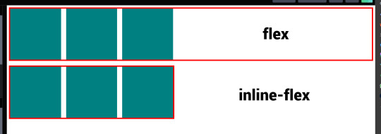
flex vs inline-flex
These two are properties that are used when you want to apply flexbox to a website layout you're building. When these are applied to the container the items within becomes flex items, but each one displays differently, somewhat.
display: flex; - the container becomes a block element of sorts and takes up 100% full width.
display: inline-flex; - it allows the container to occupy as much space that it needs allowing other things to occupy that same line.
4 notes
·
View notes
Text
4 Practical Use Cases for CSS Grids in Modern Web Design
CSS Grid is a powerful layout system that has transformed the way web designers structure and style websites. It provides a flexible, two-dimensional grid-based approach, making it easier to create complex layouts without the need for excessive code or tricky workarounds.

Download Infographic
Building Stunning Image Galleries

Image galleries are a staple in modern web design, and CSS Grid is an ideal tool for creating them. Unlike traditional layout methods, CSS Grid allows you to define precise rows and columns, making it easy to align images without breaking the overall design.
Why Use CSS Grid for Image Galleries?
Flexible Layouts: Easily control the number of columns and rows based on screen size.
Gap Control: Use the grid-gap or gap property for perfect spacing.
Responsive Design: Adjust column sizes and row heights without breaking the layout.
Layering and Positioning: Position images in creative ways, including overlapping elements.
Basic Image Gallery Example
<div class=”gallery”> <img src=”image1.jpg” alt=”Image 1″> <img src=”image2.jpg” alt=”Image 2″> <img src=”image3.jpg” alt=”Image 3″> <img src=”image4.jpg” alt=”Image 4″> <img src=”image5.jpg” alt=”Image 5″> </div>
.gallery { display: grid; grid-template-columns: repeat(auto-fill, minmax(200px, 1fr)); gap: 16px; } .gallery img { width: 100%; display: block; border-radius: 8px;
Advanced Image Gallery Layouts
Experienced web designers can also create more intricate layouts by spanning images across multiple rows or columns using the grid-column and grid-row properties, giving your galleries a more dynamic and polished look.
In this infographic blog post, we’ll explore four practical use cases for CSS Grids that can elevate your web design projects.
Try CSS Grid Generator
Creating Main Website Layouts

CSS Grid shines when it comes to designing the main structure of a website. Whether you’re building a blog, portfolio, or business website, grids provide the framework for responsive and organised layouts.
Why Use CSS Grid for Main Layouts?
Clear Structure: Define headers, sidebars, content areas, and footers precisely.
Responsive Design: Create layouts that adapt effortlessly to different screen sizes.
Efficient Code: Reduce the need for excessive wrapper divs and floats.
Complex Designs: Easily create overlapping sections and layered effects.
Basic Main Layout Example
<div class=”main-layout”> <header>Header</header> <nav>Navigation</nav> <main>Main Content</main> <aside>Sidebar</aside> <footer>Footer</footer> </div>
.main-layout { display: grid; grid-template-areas: “header header header” “nav main sidebar” “footer footer footer”; grid-template-columns: 1fr 2fr 1fr; gap: 20px; } header { grid-area: header; } nav { grid-area: nav; } main { grid-area: main; } aside { grid-area: sidebar; } footer { grid-area: footer; }
Advanced Main Layouts
For more complex designs, consider using CSS Grid in combination with Flexbox for greater flexibility and control over nested elements.
Designing Attention-Grabbing Banners

Banners are crucial for grabbing user attention, and CSS Grid makes it easy to create stunning, multi-layered designs without relying on complex positioning hacks.
Why Use CSS Grid for Banners?
Flexible Positioning: Easily place text, images, and buttons exactly where you want them.
Responsive Design: Maintain structure across different devices.
Layer Control: Use grid layers to create engaging, multi-dimensional designs.
Basic Banner Example
<div class=”banner”> <div class=”overlay”></div> <h1>Welcome to Our Website</h1> <p>Discover our range of services.</p> <button>Learn More</button> </div>
.banner { display: grid; grid-template-areas: “overlay”; position: relative; background-image: url(‘banner.jpg’); background-size: cover; background-position: center; height: 300px; color: #fff; text-align: center; } .overlay { grid-area: overlay; background-color: rgba(0, 0, 0, 0.6); position: absolute; top: 0; left: 0; right: 0; bottom: 0; z-index: 1; } .banner h1, .banner p, .banner button { position: relative; z-index: 2; }
Perfectly Centring Items

Centred layouts are a common design choice, and CSS Grid provides a simple way to centre content without relying on margin hacks or flexbox tricks.
Why Use CSS Grid for Centring?
Simplicity: One line of code can achieve perfect centring.
Cross-Browser Support: Reliable centring across all major browsers.
Versatility: Works for both single items and entire sections.
Basic Centring Example
<div class=”centre”> <h2>Centred Content</h2> </div>
.centre { display: grid; place-items: center; height: 300px; background-color: #f4f4f4; }
Conclusion
CSS Grid is an incredibly versatile tool that can streamline your web design workflow, reduce code complexity, and enhance the overall user experience.
Whether you’re building image galleries, main layouts, banners, or perfectly centred designs, CSS Grid offers a flexible and powerful solution.
Experiment with these practical use cases to unlock the full potential of CSS Grid in your projects.
0 notes
Text
Revisiting CSS Multi-Column Layout
New Post has been published on https://thedigitalinsider.com/revisiting-css-multi-column-layout/
Revisiting CSS Multi-Column Layout
Honestly, it’s difficult for me to come to terms with, but almost 20 years have passed since I wrote my first book, Transcending CSS. In it, I explained how and why to use what was the then-emerging Multi-Column Layout module.
Hint: I published an updated version, Transcending CSS Revisited, which is free to read online.
Perhaps because, before the web, I’d worked in print, I was over-excited at the prospect of dividing content into columns without needing extra markup purely there for presentation. I’ve used Multi-Column Layout regularly ever since. Yet, CSS Columns remains one of the most underused CSS layout tools. I wonder why that is?
Holes in the specification
For a long time, there were, and still are, plenty of holes in Multi-Column Layout. As Rachel Andrew — now a specification editor — noted in her article five years ago:
“The column boxes created when you use one of the column properties can’t be targeted. You can’t address them with JavaScript, nor can you style an individual box to give it a background colour or adjust the padding and margins. All of the column boxes will be the same size. The only thing you can do is add a rule between columns.”
She’s right. And that’s still true. You can’t style columns, for example, by alternating background colours using some sort of :nth-column() pseudo-class selector. You can add a column-rule between columns using border-style values like dashed, dotted, and solid, and who can forget those evergreen groove and ridge styles? But you can’t apply border-image values to a column-rule, which seems odd as they were introduced at roughly the same time. The Multi-Column Layout is imperfect, and there’s plenty I wish it could do in the future, but that doesn’t explain why most people ignore what it can do today.
Patchy browser implementation for a long time
Legacy browsers simply ignored the column properties they couldn’t process. But, when Multi-Column Layout was first launched, most designers and developers had yet to accept that websites needn’t look the same in every browser.
Early on, support for Multi-Column Layout was patchy. However, browsers caught up over time, and although there are still discrepancies — especially in controlling content breaks — Multi-Column Layout has now been implemented widely. Yet, for some reason, many designers and developers I speak to feel that CSS Columns remain broken. Yes, there’s plenty that browser makers should do to improve their implementations, but that shouldn’t prevent people from using the solid parts today.
Readability and usability with scrolling
Maybe the main reason designers and developers haven’t embraced Multi-Column Layout as they have CSS Grid and Flexbox isn’t in the specification or its implementation but in its usability. Rachel pointed this out in her article:
“One reason we don’t see multicol used much on the web is that it would be very easy to end up with a reading experience which made the reader scroll in the block dimension. That would mean scrolling up and down vertically for those of us using English or another vertical writing mode. This is not a good reading experience!”
That’s true. No one would enjoy repeatedly scrolling up and down to read a long passage of content set in columns. She went on:
“Neither of these things is ideal, and using multicol on the web is something we need to think about very carefully in terms of the amount of content we might be aiming to flow into our columns.”
But, let’s face it, thinking very carefully is what designers and developers should always be doing.
Sure, if you’re dumb enough to dump a large amount of content into columns without thinking about its design, you’ll end up serving readers a poor experience. But why would you do that when headlines, images, and quotes can span columns and reset the column flow, instantly improving readability? Add to that container queries and newer unit values for text sizing, and there really isn’t a reason to avoid using Multi-Column Layout any longer.
A brief refresher on properties and values
Let’s run through a refresher. There are two ways to flow content into multiple columns; first, by defining the number of columns you need using the column-count property:
Second, and often best, is specifying the column width, leaving a browser to decide how many columns will fit along the inline axis. For example, I’m using column-width to specify that my columns are over 18rem. A browser creates as many 18rem columns as possible to fit and then shares any remaining space between them.
Then, there is the gutter (or column-gap) between columns, which you can specify using any length unit. I prefer using rem units to maintain the gutters’ relationship to the text size, but if your gutters need to be 1em, you can leave this out, as that’s a browser’s default gap.
The final column property is that divider (or column-rule) to the gutters, which adds visual separation between columns. Again, you can set a thickness and use border-style values like dashed, dotted, and solid.
These examples will be seen whenever you encounter a Multi-Column Layout tutorial, including CSS-Tricks’ own Almanac. The Multi-Column Layout syntax is one of the simplest in the suite of CSS layout tools, which is another reason why there are few reasons not to use it.
Multi-Column Layout is even more relevant today
When I wrote Transcending CSS and first explained the emerging Multi-Column Layout, there were no rem or viewport units, no :has() or other advanced selectors, no container queries, and no routine use of media queries because responsive design hadn’t been invented.
We didn’t have calc() or clamp() for adjusting text sizes, and there was no CSS Grid or Flexible Box Layout for precise control over a layout. Now we do, and all these properties help to make Multi-Column Layout even more relevant today.
Now, you can use rem or viewport units combined with calc() and clamp() to adapt the text size inside CSS Columns. You can use :has() to specify when columns are created, depending on the type of content they contain. Or you might use container queries to implement several columns only when a container is large enough to display them. Of course, you can also combine a Multi-Column Layout with CSS Grid or Flexible Box Layout for even more imaginative layout designs.
Using Multi-Column Layout today
Patty Meltt is an up-and-coming country music sensation. She’s not real, but the challenges of designing and developing websites like hers are.
My challenge was to implement a flexible article layout without media queries which adapts not only to screen size but also whether or not a <figure> is present. To improve the readability of running text in what would potentially be too-long lines, it should be set in columns to narrow the measure. And, as a final touch, the text size should adapt to the width of the container, not the viewport.
Article with no <figure> element. What would potentially be too-long lines of text are set in columns to improve readability by narrowing the measure.
Article containing a <figure> element. No column text is needed for this narrower measure.
The HTML for this layout is rudimentary. One <section>, one <main>, and one <figure> (or not:)
<section> <main> <h1>About Patty</h1> <p>…</p> </main> <figure> <img> </figure> </section>
I started by adding Multi-Column Layout styles to the <main> element using the column-width property to set the width of each column to 40ch (characters). The max-width and automatic inline margins reduce the content width and center it in the viewport:
main margin-inline: auto; max-width: 100ch; column-width: 40ch; column-gap: 3rem; column-rule: .5px solid #98838F;
Next, I applied a flexible box layout to the <section> only if it :has() a direct descendant which is a <figure>:
section:has(> figure) display: flex; flex-wrap: wrap; gap: 0 3rem;
This next min-width: min(100%, 30rem) — applied to both the <main> and <figure> — is a combination of the min-width property and the min() CSS function. The min() function allows you to specify two or more values, and a browser will choose the smallest value from them. This is incredibly useful for responsive layouts where you want to control the size of an element based on different conditions:
section:has(> figure) main flex: 1; margin-inline: 0; min-width: min(100%, 30rem); section:has(> figure) figure flex: 4; min-width: min(100%, 30rem);
What’s efficient about this implementation is that Multi-Column Layout styles are applied throughout, with no need for media queries to switch them on or off.
Adjusting text size in relation to column width helps improve readability. This has only recently become easy to implement with the introduction of container queries, their associated values including cqi, cqw, cqmin, and cqmax. And the clamp() function. Fortunately, you don’t have to work out these text sizes manually as ClearLeft’s Utopia will do the job for you.
My headlines and paragraph sizes are clamped to their minimum and maximum rem sizes and between them text is fluid depending on their container’s inline size:
h1 font-size: clamp(5.6526rem, 5.4068rem + 1.2288cqi, 6.3592rem); h2 font-size: clamp(1.9994rem, 1.9125rem + 0.4347cqi, 2.2493rem); p font-size: clamp(1rem, 0.9565rem + 0.2174cqi, 1.125rem);
So, to specify the <main> as the container on which those text sizes are based, I applied a container query for its inline size:
main container-type: inline-size;
Open the final result in a desktop browser, when you’re in front of one. It’s a flexible article layout without media queries which adapts to screen size and the presence of a <figure>. Multi-Column Layout sets text in columns to narrow the measure and the text size adapts to the width of its container, not the viewport.
Modern CSS is solving many prior problems
Structure content with spanning elements which will restart the flow of columns and prevent people from scrolling long distances.
Prevent figures from dividing their images and captions between columns.
Almost every article I’ve ever read about Multi-Column Layout focuses on its flaws, especially usability. CSS-Tricks’ own Geoff Graham even mentioned the scrolling up and down issue when he asked, “When Do You Use CSS Columns?”
“But an entire long-form article split into columns? I love it in newspapers but am hesitant to scroll down a webpage to read one column, only to scroll back up to do it again.”
Fortunately, the column-span property — which enables headlines, images, and quotes to span columns, resets the column flow, and instantly improves readability — now has solid support in browsers:
h1, h2, blockquote column-span: all;
But the solution to the scrolling up and down issue isn’t purely technical. It also requires content design. This means that content creators and designers must think carefully about the frequency and type of spanning elements, dividing a Multi-Column Layout into shallower sections, reducing the need to scroll and improving someone’s reading experience.
Another prior problem was preventing headlines from becoming detached from their content and figures, dividing their images and captions between columns. Thankfully, the break-after property now also has widespread support, so orphaned images and captions are now a thing of the past:
figure break-after: column;
Open this final example in a desktop browser:
You should take a fresh look at Multi-Column Layout
Multi-Column Layout isn’t a shiny new tool. In fact, it remains one of the most underused layout tools in CSS. It’s had, and still has, plenty of problems, but they haven’t reduced its usefulness or its ability to add an extra level of refinement to a product or website’s design. Whether you haven’t used Multi-Column Layout in a while or maybe have never tried it, now’s the time to take a fresh look at Multi-Column Layout.
#:has#ADD#almanac#Article#Articles#back up#background#book#box#browser#challenge#clamp#colours#columns#container#content#course#creators#CSS#CSS Grid#css-tricks#Design#designers#desktop#developers#digitalocean#display#easy#English#Explained
2 notes
·
View notes
Text
Responsive Web Design: The Key to Modern Website Success
In an era where users access the internet through a wide range of devices—smartphones, tablets, laptops, and desktops—having a flexible, user-friendly website is crucial. Responsive Web Design (RWD) has become a standard practice in web development, ensuring that websites automatically adapt to various screen sizes and deliver an optimal user experience.
What is Responsive Web Design?
Responsive web design is an approach that allows web content to dynamically adjust based on the screen size, orientation, and resolution of the user’s device. Instead of building multiple versions of a website, developers create one flexible design that works seamlessly across all platforms.
Core Elements of Responsive Web Design
Flexible Grid Layouts: CSS flexbox and grid systems enable fluid and proportionate designs.
Media Queries: CSS rules that apply different styles based on device features such as width and resolution.
Fluid Media: Images and videos scale appropriately to fit the screen.
Mobile-First Design: Begins with mobile usability in mind and scales up for larger screens.
Consistent User Interface: Ensures easy navigation and a cohesive experience across devices.
Why Responsive Web Design is Crucial
1. Boosts User Experience
A responsive site offers a seamless browsing experience, encouraging users to stay longer and interact more. A consistent layout and intuitive navigation improve satisfaction and engagement.
2. Improves SEO Performance
Google prioritizes mobile-friendly websites in its search algorithm. A responsive design enhances search engine rankings, reduces bounce rates, and boosts page load speeds, all of which are critical SEO factors.
3. Increases Mobile Traffic
With over half of web traffic now coming from mobile devices, responsive design is essential. It ensures accessibility and usability for the growing mobile audience.
4. Reduces Maintenance and Costs
Rather than maintaining separate desktop and mobile sites, a single responsive website streamlines updates and reduces overall costs.
5. Faster Loading Speeds
Responsive websites are often better optimized for speed. Faster sites improve retention and help with search engine optimization (SEO) efforts.
6. Higher Conversion Rates
When users can browse, shop, or fill forms easily on any device, it increases trust and drives conversions—critical for e-commerce and lead generation.
7. Future-Proof and Scalable
Responsive design adapts to new devices and screen types, making your website more sustainable and scalable for the future.
How Responsive Web Design Works
Flexible Layouts: Grids and CSS frameworks like Bootstrap create adaptable layouts.
Media Queries: Tailor visual elements and styling to different screen properties.
Optimized Assets: Compress and resize images using modern formats like WebP to maintain performance.
Common Challenges of Responsive Web Design
Complex Development: Building for all devices requires detailed planning and testing.
Browser Compatibility: Ensuring older browsers support modern features can be difficult.
Performance Issues: Unoptimized images and scripts can hinder load times.
Best Practices for Responsive Web Design
Adopt a Mobile-First Strategy
Use Scalable Fonts and Buttons
Optimize Images and Media Files
Test Across Multiple Devices and Browsers
Apply Lazy Loading and Browser Caching
Conclusion
Responsive web design is not just an option—it’s a necessity for any business that wants to succeed in the digital space. It boosts SEO, enhances user experience, increases conversions, and ensures your website remains competitive across all devices.
Investing in a responsive website is investing in your brand's online visibility, credibility, and growth. Whether launching a new site or updating an existing one, adopting responsive web design is a smart, future-proof decision.
0 notes